


Gem has been established for some time now and it's so clear she loves every second of teaching. Gem wanted to elevate her business to something which reflects who she is, where she is and what she does..
Gem contacted me as she liked my previous work and felt she could trust me to find the solution and create a brand to encapsulate her teaching style. .
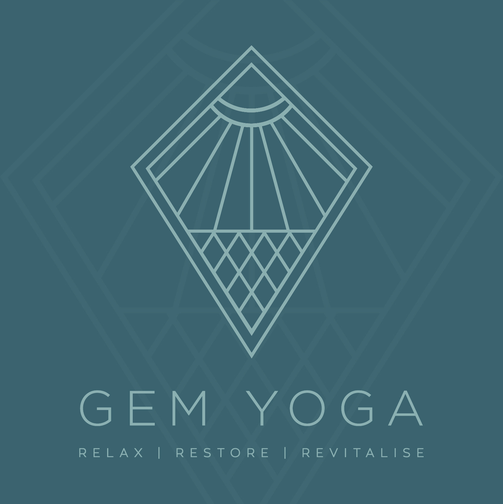
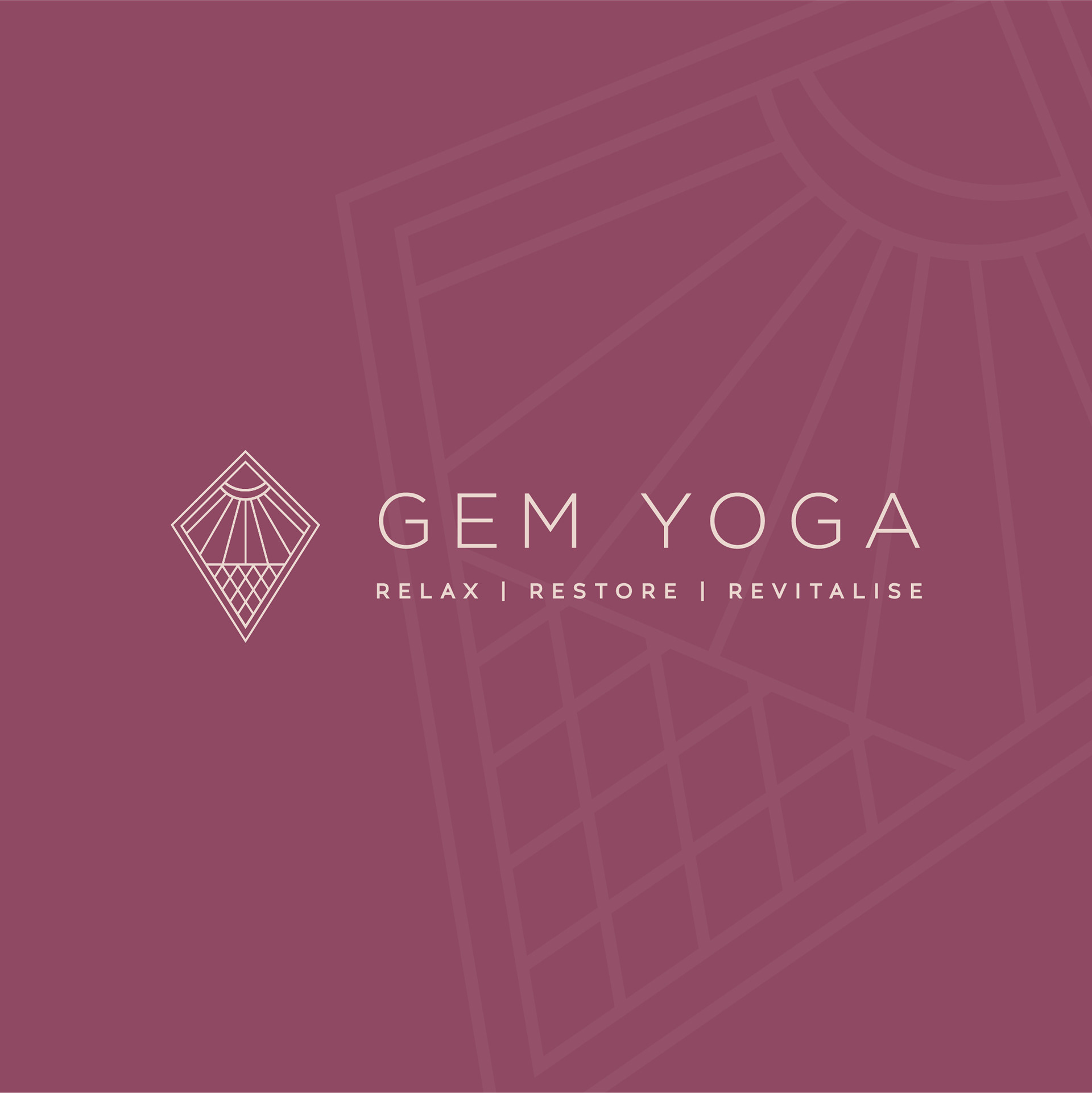
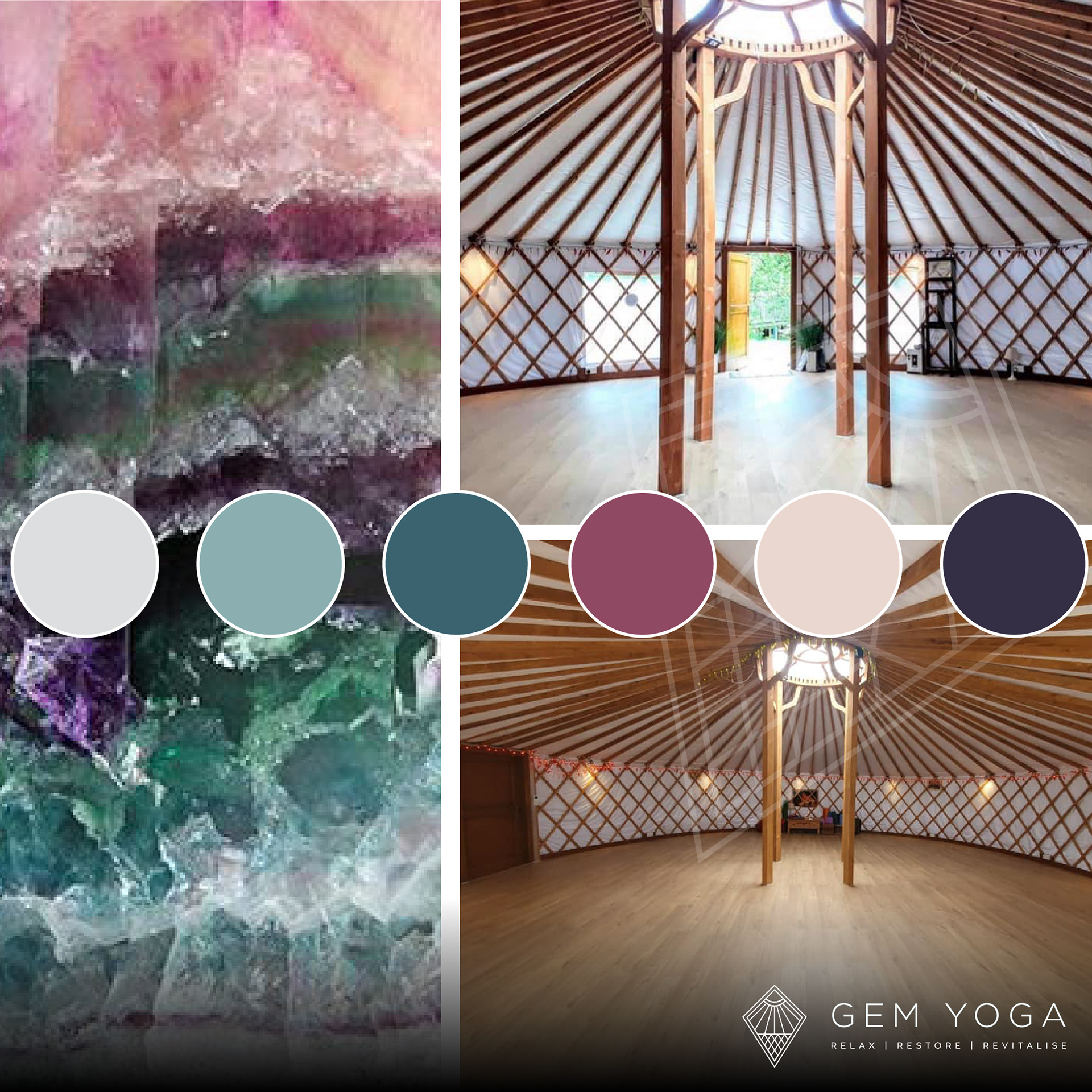
As well as the given hint of Gem's first name, Gemma uses crystals daily and in her practice so she wanted a nod to gem stones, I then drew on this to create a colour palette reflective of the colours found in amethysts which are natural stress relievers, mood balancers and negativity dissolvers. .
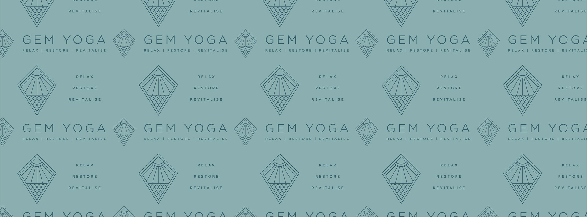
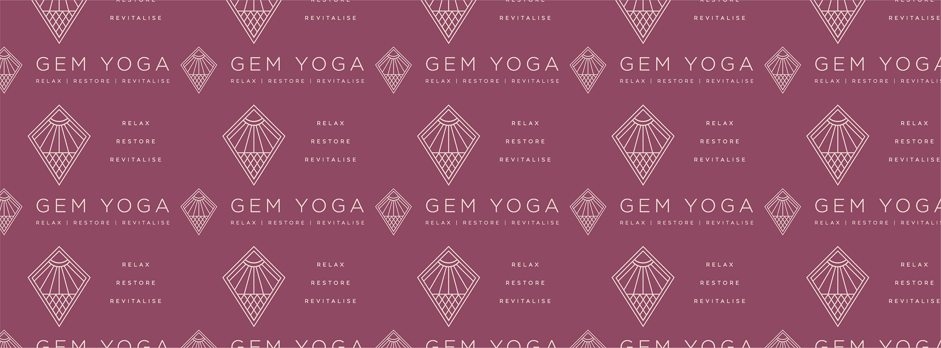
The final logo which we developed drew upon the outer shape being a typical gemstone icon, while internally the shapes formed the beautiful patterns of the yurt in which Gem teaches her classes. These shapes also make a gesture to the sun, moon and earth, all significant elements in yoga practice. Gem also interpreted the logo further, the cross hatch representing the tightening of muscles and fascia and sun rays are the release and flow of the breath.